The toolkit behind every chart.
15 indicators and analytical tools: from real-time liquidation analysis to institutional macro flows. Same liquidity engine, different lenses.
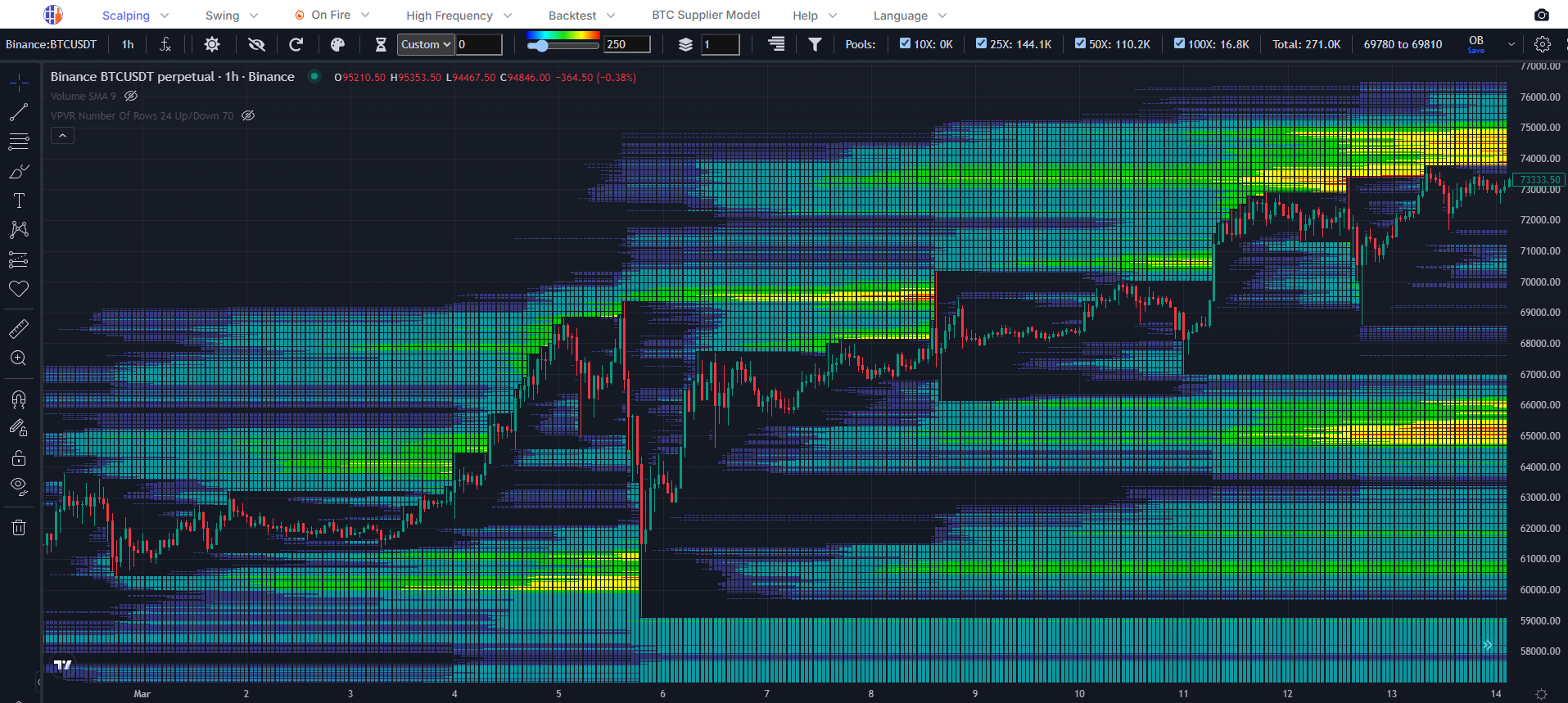
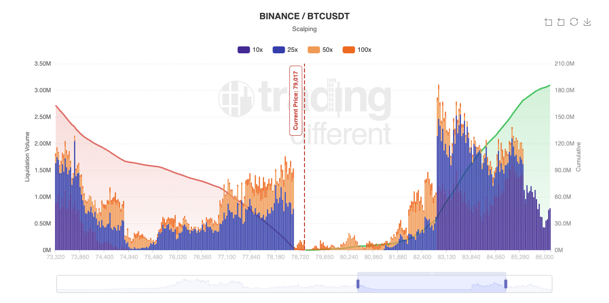
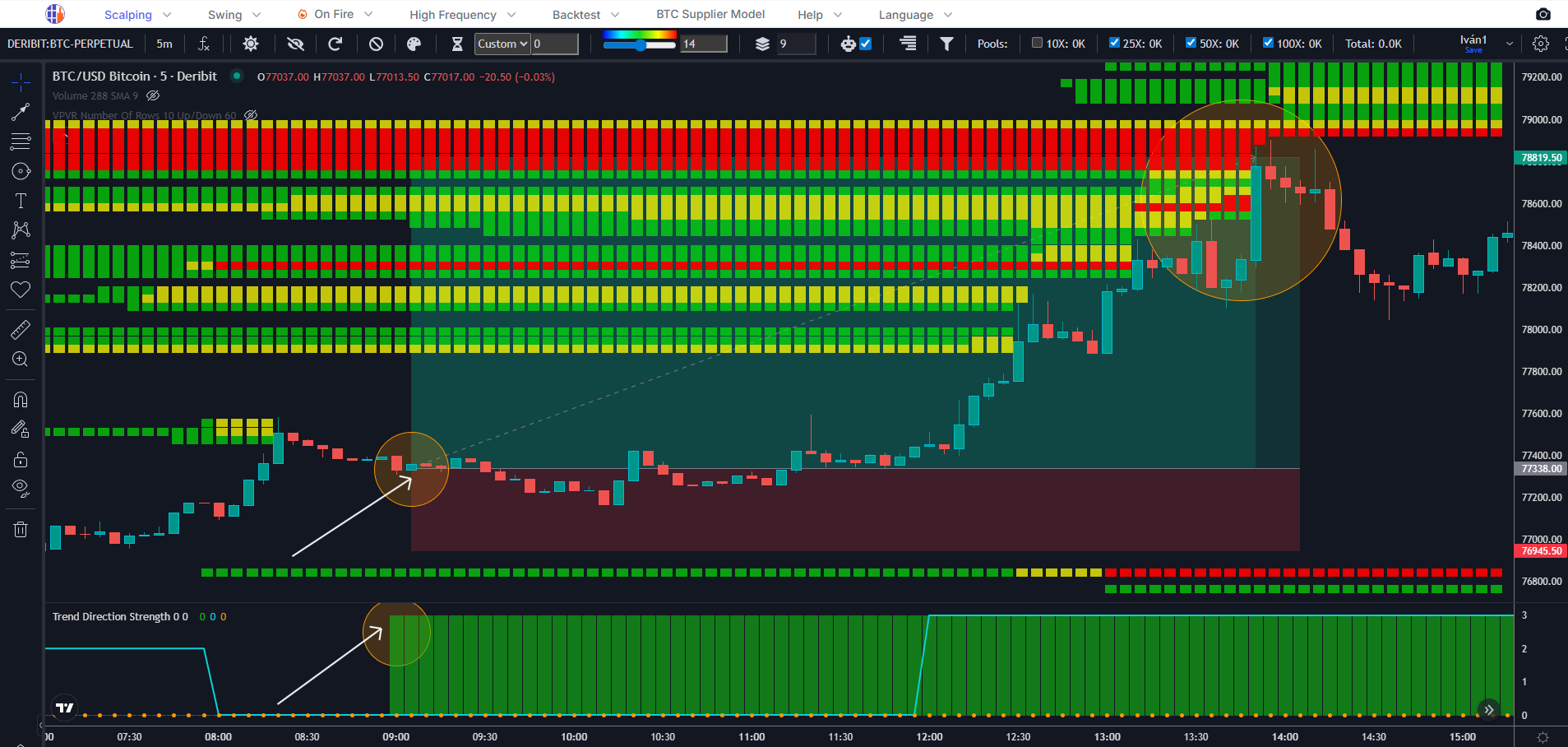
Liquidation Heatmap
The institutional-grade liquidation map across crypto, forex, ETFs and stocks. Real-time visualization of liquidation pools across 5 derivatives venues, calibrated by 7 years of live performance against real flow.
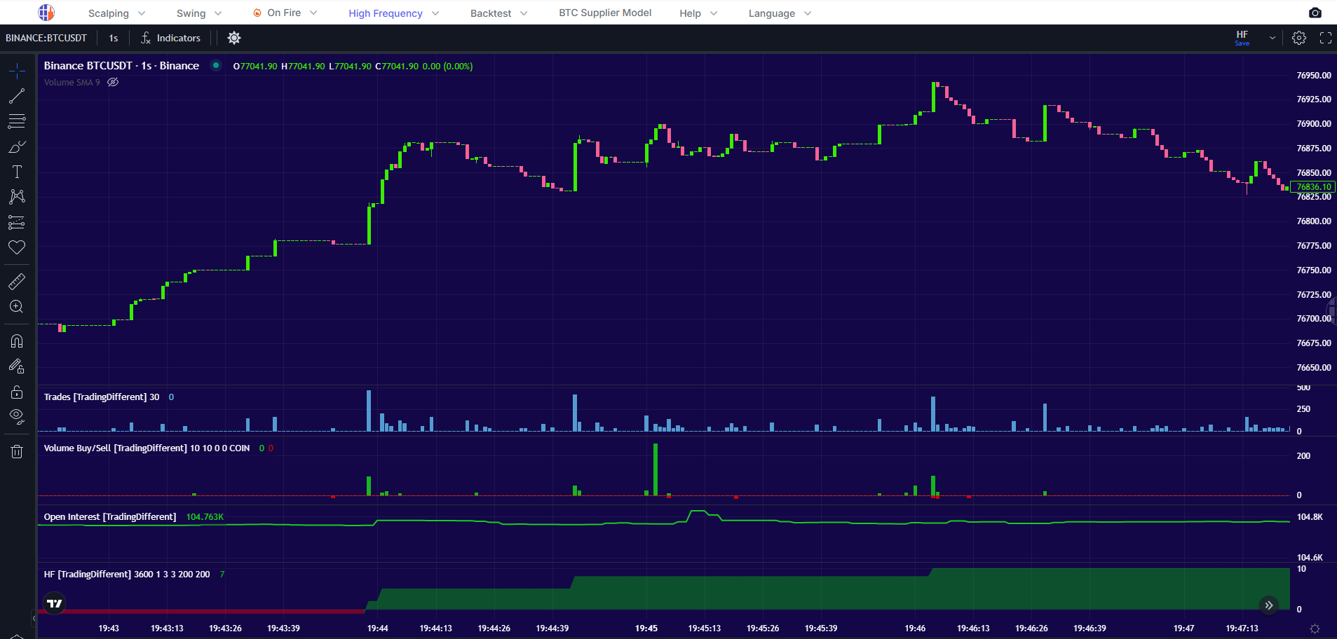
High Frequency Chart
Tick-level activity from high-frequency trading bots. 1-second interval data showing aggressive buy/sell orders and bot direction across 35 symbols, microsecond activity invisible on standard timeframes.
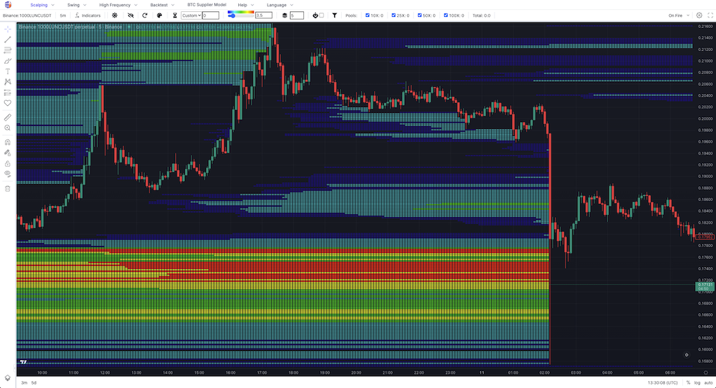
On Fire Heatmap & HF
The altcoin generating the most liquidation activity right now, surfaced live. Get free access to the Liquidation Heatmap and HF Chart for the featured symbol, no subscription required.
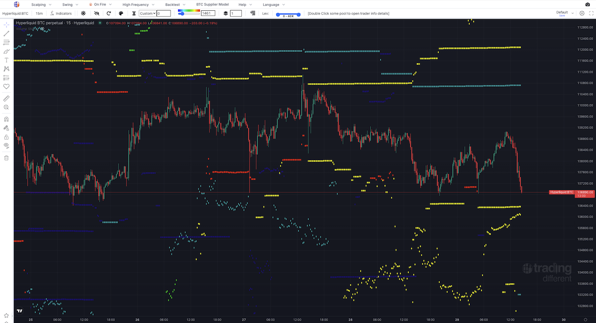
Hyperliquid Heatmap + Whales
Decentralized exchange liquidation analysis. Unlike CEXs, these are actual on-chain whale positions, not estimates. See real liquidation levels up to 40x leverage on Hyperliquid.
Liquidation Simple Map
A streamlined view of the same liquidation data: surface only the most relevant zones where leveraged positions are at risk.
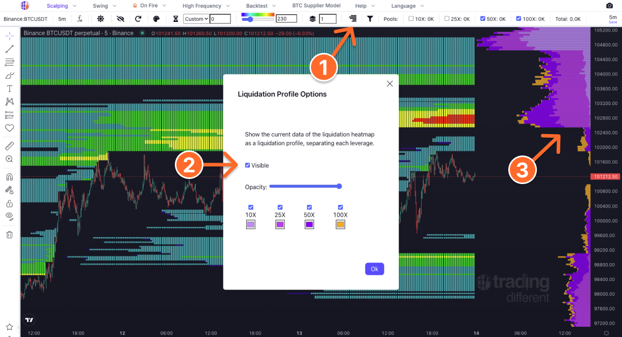
Liquidation Profile
Liquidation levels broken down by leverage. See exactly where 100x, 50x, 25x and 10x positions concentrate, and where each one will get washed out.
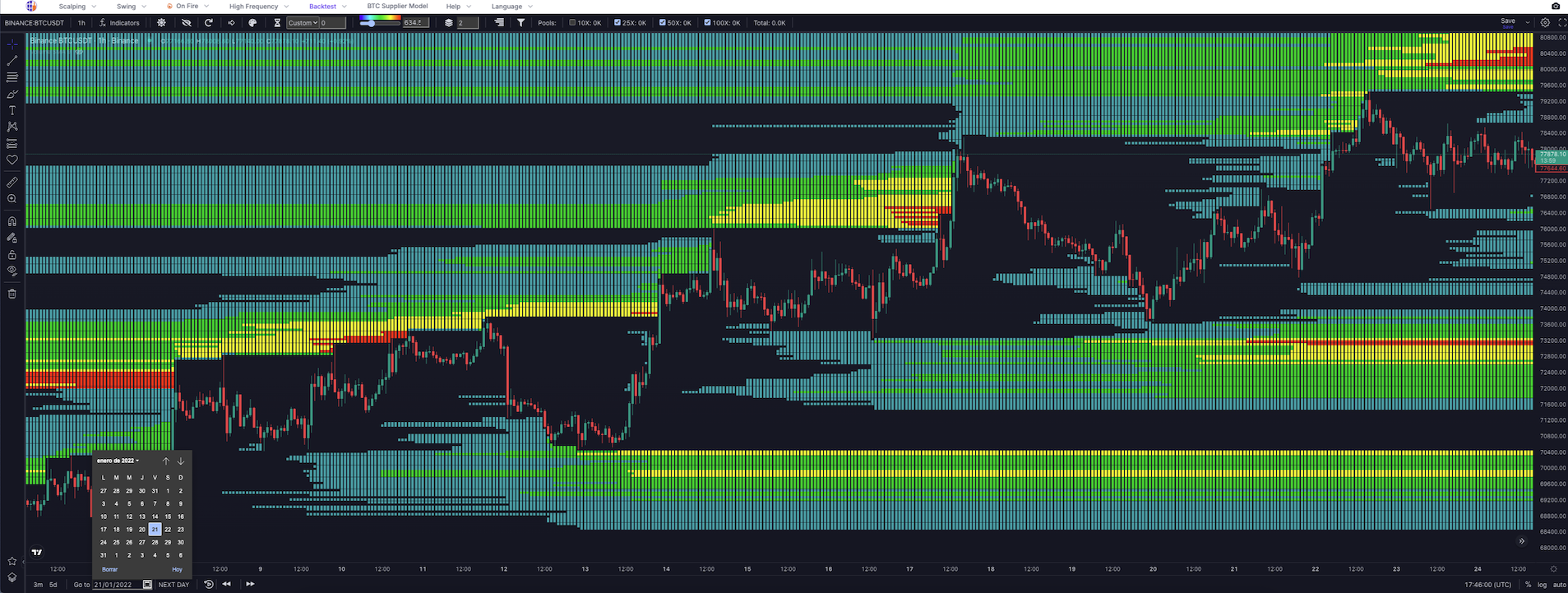
Historical Chart
Bitcoin price history since 2021 with the full indicator stack overlaid. Calendar search to jump to any date for backtesting and pattern detection: Open Interest, Volume Buy/Sell, Liquidations and TrenDiff all included.
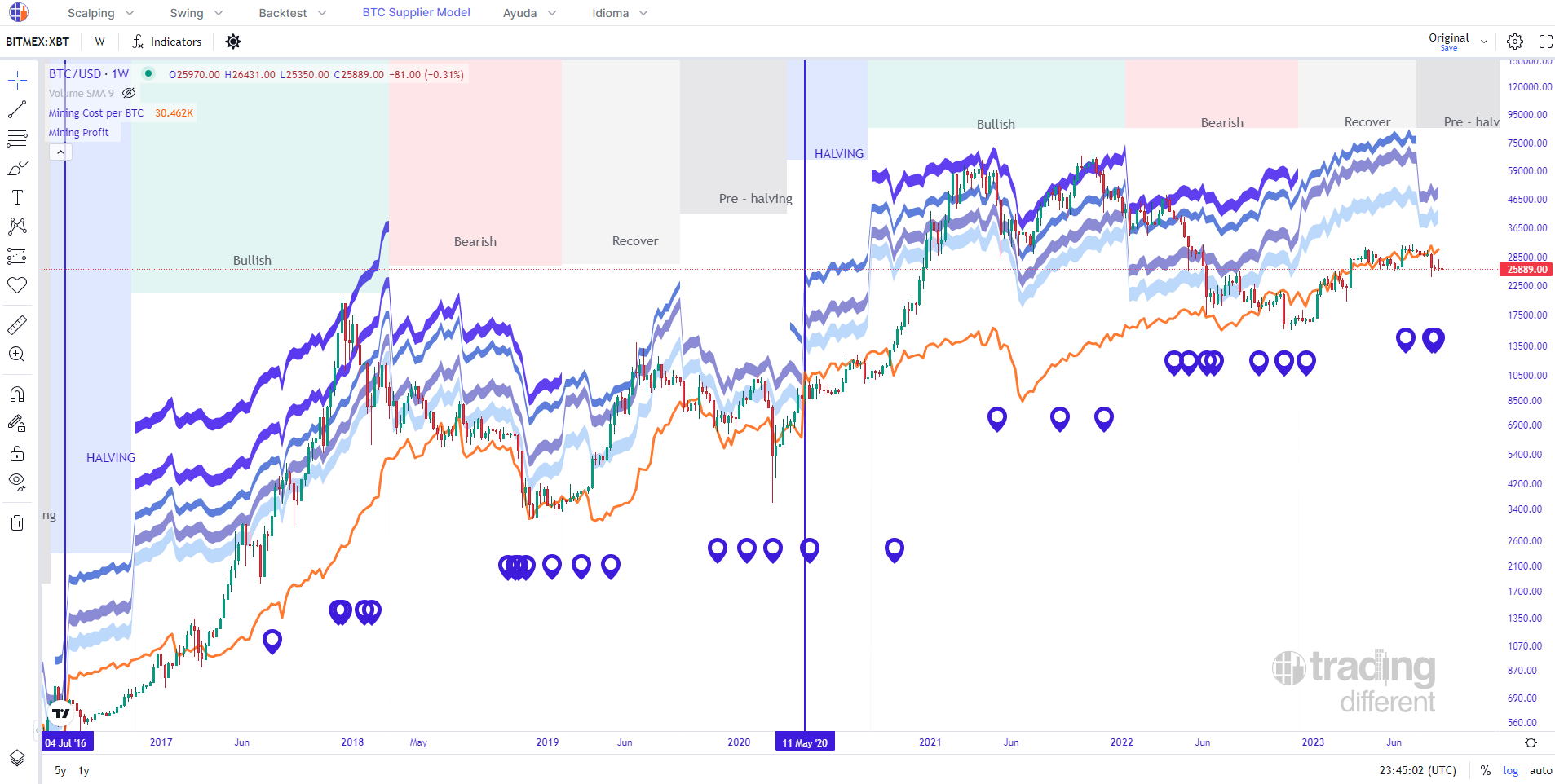
BTC Supplier Model
Total mining cost analysis for 1 BTC: electricity, equipment amortization, maintenance, cooling, taxes, administration. See mining profit zones and key market stage milestones overlaid on the chart.
TrenDiff Indicator
Indicator that marks the main trend of the market and helps us to operate in the same direction, seeking the Liquidation Pools as Take Profit targets. *Only available for Bitcoin.
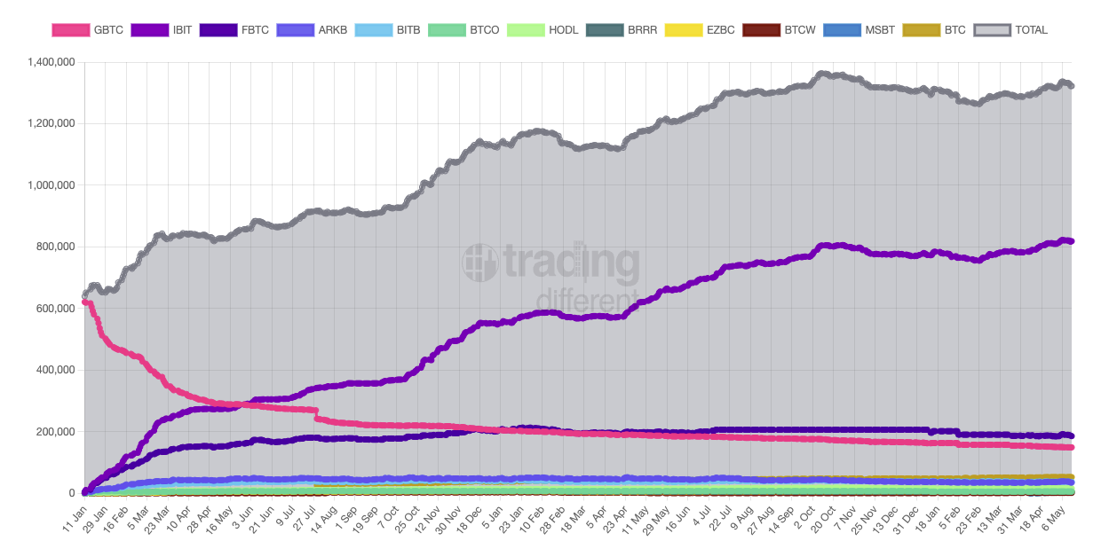
ETF & Companies: Bitcoin Holders
Track Bitcoin holdings across spot ETF issuers, public and private companies, and sovereign holders. Real-time institutional accumulation in one view.
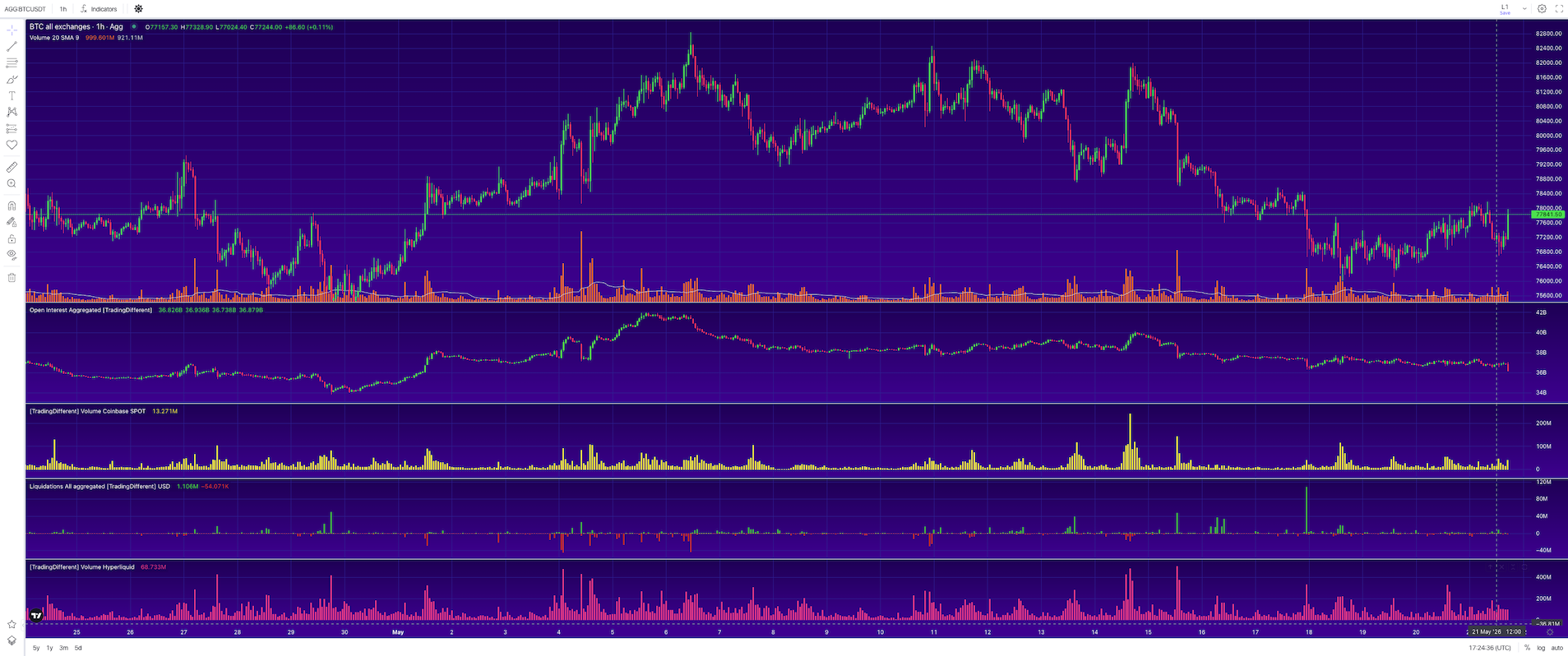
Bitcoin Aggregated Data
A consolidated dashboard pulling Bitcoin metrics from 12+ exchanges. Volume, Coinbase spot flow, whale activity, Open Interest and liquidations in one view.
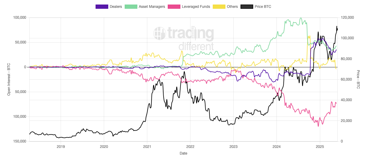
CME Futures
Bitcoin and Ethereum futures data from CME: open interest, volume and institutional positioning from the traditional derivatives venue.
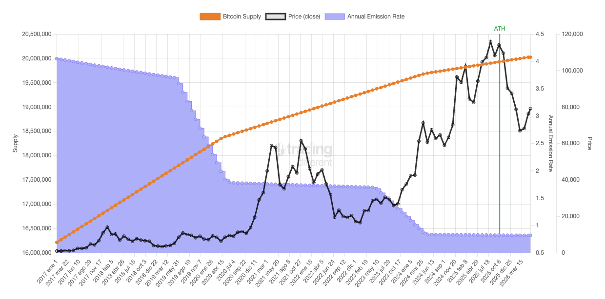
Crypto Emission Rate
Supply evolution and emission curves for the major cryptocurrencies. ATH analysis and portfolio shortlisting tool based on emission characteristics.
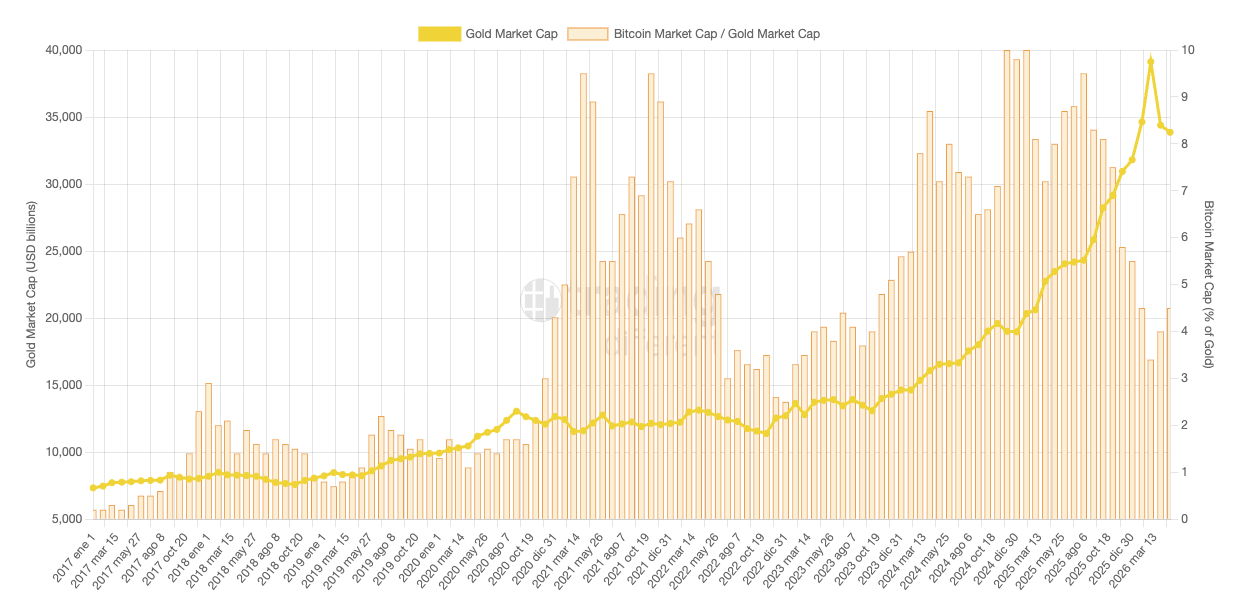
Bitcoin vs Gold
Long-form comparison of Bitcoin and gold: market cap, historical supply evolution, emission rates. The macro reference chart for the digital-gold thesis.
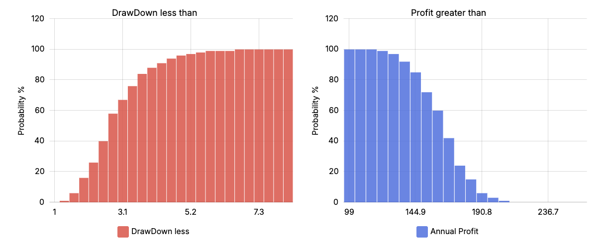
Risk Calculator
Position sizing and stop-loss calculator based on risk percentage. Test strategies, analyze Risk/Reward ratios, and model the impact of recurring fees on long-term results.
One subscription.
15 tools.
Pick a path: Trader gets the full toolkit, Holder gets the macro stack. Free tools stay free.